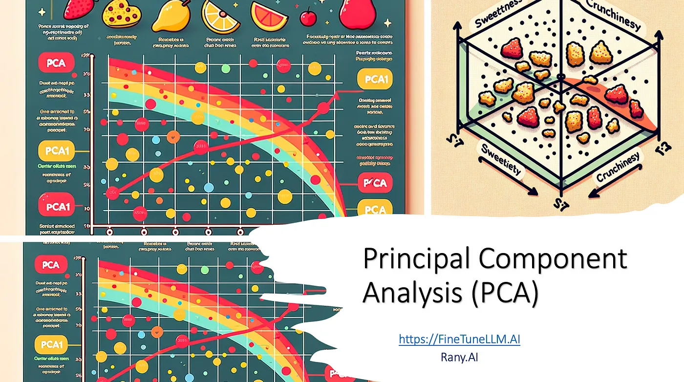
Principal Component Analysis (PCA)
Principal Component Analysis (PCA) is a statistical technique used to simplify the complexity in high-dimensional data while retaining trends and patterns. It does this by transforming the data into fewer dimensions, which act as summaries of features. This transformation is performed while preserving as much of the data’s variation as possible. Let’s break it down with an example.
Imagine you’re at a fruit market trying to decide which fruits to buy. You might consider a variety of features, like color, size, sweetness, and price. But what if you only had a few seconds to make a choice? You’d probably prioritize just one or two key features to quickly make your decision.
This is essentially what Principal Component Analysis (PCA) does in the world of data. It’s a way to simplify complex information. PCA helps us focus on the most important features within a large set of data. Just like how you might only consider sweetness and size to decide on fruit, PCA identifies the most telling characteristics of a dataset, reducing the amount of information we need to look at, while still keeping the essence of the data intact.
Let’s say we have a list of cars, and each car is described by its speed, fuel efficiency, engine size, and price. If we want to summarize this list and compare the cars quickly, we could use PCA to combine these features into something like a “performance score” and a “value score.” These scores give us a simpler, yet still powerful, way to look at and compare all the different cars.
In this article, we’re going to explore how PCA works, using clear examples and easy-to-understand language. We’ll see how it takes a complex set of data and distills it down to the key points, making our analysis quicker and more effective. So, buckle up, and let’s dive into the world of PCA!
Variance Explained:
Variance explained refers to the proportion of the dataset’s total variation that is attributed to each principal component. In PCA, components are ordered by the amount of variance they explain, from the greatest to the least.
To explain this concept with an example, consider a dataset containing information on various types of vehicles. Each vehicle is described by multiple features such as fuel efficiency, top speed, engine power, price, and brand prestige.
In this case, when we perform PCA, we might find that engine power and top speed are the features that explain the most variance within the dataset. These features could correlate with a vehicle’s performance. When we apply PCA, the first principal component may well align with these performance-related features because they vary the most among different vehicles. Perhaps the first principal component might be interpreted as a ‘performance index’ that combines engine power and top speed into a single, new metric.
Similarly, the second principal component might capture another aspect of the data, like cost-effectiveness, which combines fuel efficiency and price. This would give us another new metric that summarizes the data from a different angle.
A second example about housing where the size of the house is more important than the color in explaining the variance in house prices. In the vehicle example, the ‘performance index’ and ‘cost-effectiveness’ could be more important in explaining the variance in the dataset compared to the brand prestige, which might not vary as much across different vehicles.
The idea is that PCA allows us to prioritize and summarize the features that actually matter in describing the dataset’s variability, making it easier to analyze and interpret the data.
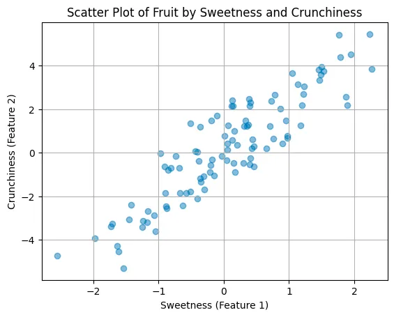
Let’s go back to the fruit market example :) . When we visit a fruit market, we encounter fruits with various features: some are sweet, some are sour, some are crunchy, and others are soft. If we want to categorize these fruits based on how different they are from each other, we might start by looking at which features show the most variation. In PCA terms, this means we’re looking for the feature that best explains the differences between the fruits, or the feature that has the highest variance.
Using PCA, we can find out that, for instance, sweetness and crunchiness are the two features that vary the most and are, therefore, the most informative about our fruit selection. These two features are like the size of a house when considering property prices: they are important and have more explanatory power than other features. For fruits, sweetness may be more critical than color in determining preference or market value, just as the size of a house is more significant than its color in determining its price.
So, if we apply PCA to our fruit data, we could find that the first principal component is a new value with a percentage of both Sweetness and Crunchiness. It will be a completely new feature, but it will explain more about the variations. This means that knowing where a fruit lies on this first component gives us a good idea of its overall profile regarding the most varying and significant features. This component captures the essence of the fruit’s characteristics in terms of sweetness and crunchiness, simplifying the complexity of choosing a fruit based on multiple features to just looking at one or two composite scores that combine these features in a meaningful way. We might find that crunchiness and sweetness together account for a large part of the variance in the dataset. This means that these two features combined can give us a good understanding of the differences between the fruits. If PCA tells us that the first principal component (a combination of crunchiness and sweetness) explains 70% of the variance, this means that by knowing just the first principal component, we have a 70% understanding of the differences between the fruits in our dataset. PCA allows us to quantify the importance of different features in terms of how well they explain the diversity of the data. It’s like finding out which characteristics of fruits tell us the most about the variety of fruits available at the market.
Now, let’s use some diagrams:
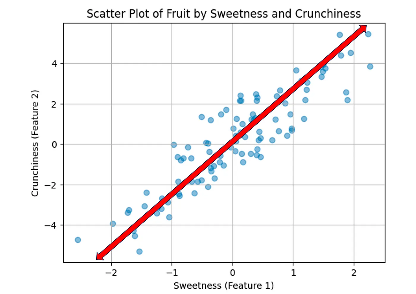
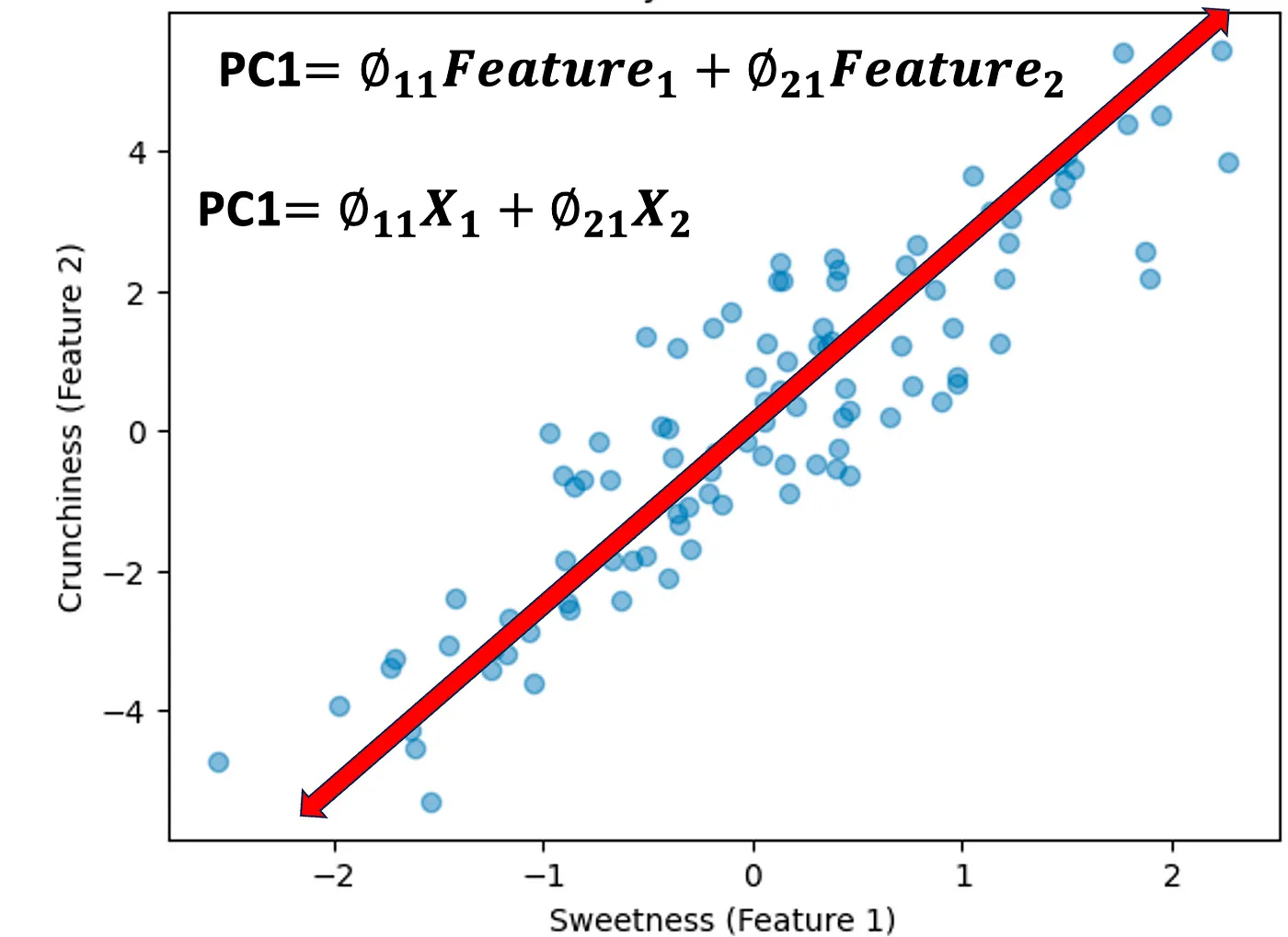
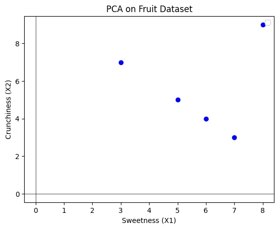
Here is a scatter plot representing the relationship between sweetness and crunchiness for a set of fruit data points. This plot shows a positive correlation between the two features, indicating that, generally, sweeter fruits in this dataset also tend to be crunchier.
Now, we need to find a new way to visualize this data and reduce features to one feature (PC1), that can join both Sweetness and Crunchiness. It will not be any of them, but it will be a combination.
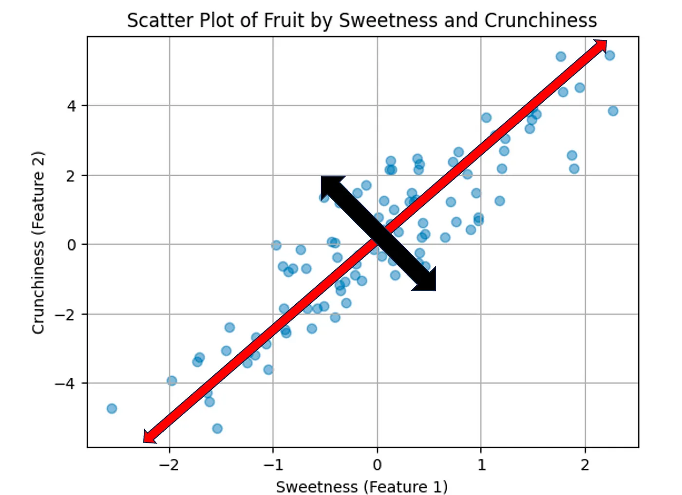
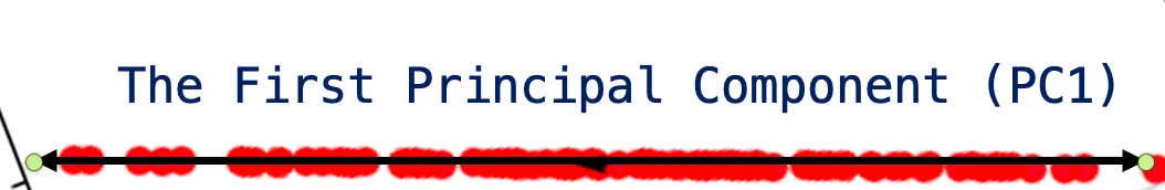
The new red axis above represents both features, Crushiness and Sweetness. This line explains the most dispersion of this dataset. If we collapse all these points into this one line, we will have the most dispersion explained versus, for example, the black orthogonal line in the diagram below:
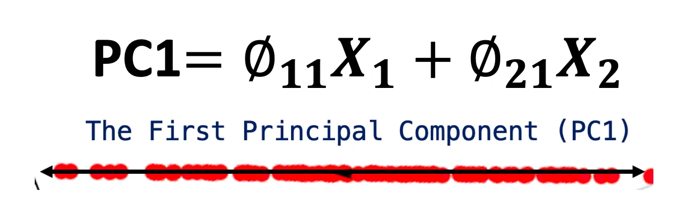
Now, we will collapse all the data into this new one feature that is called Principal Component 1.
Note that this PC1 is the Eigen Vector
If we removed the original data, it will look as follows:
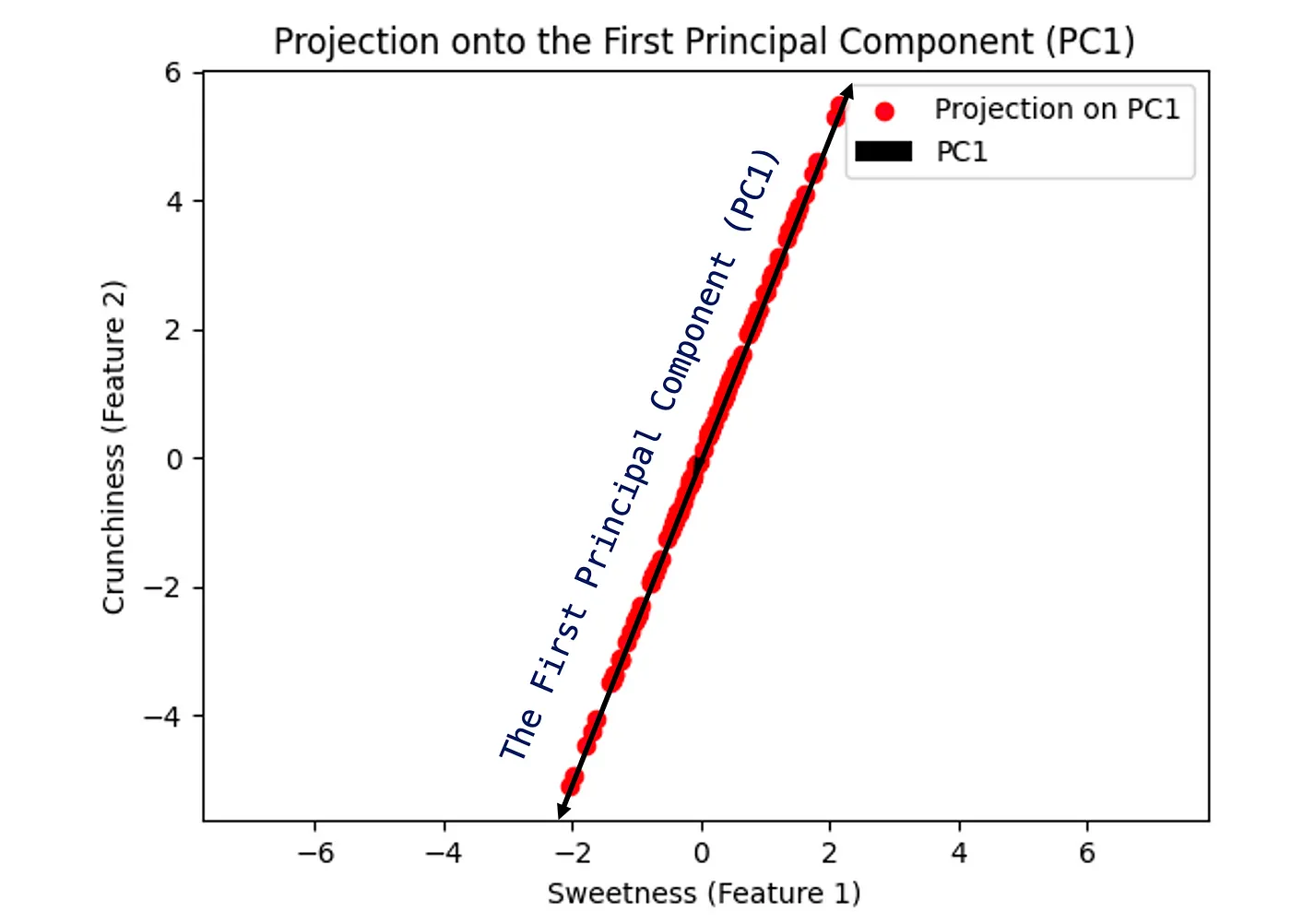
PC1 will order components according to the variance explained. In this example, I am reducing two features in 2 dimensions to 1 feature, which is one dimension
The PC1 in a linear component of feature1 and feature2, which is one axis as shown above. Of course, you will see the benefits when you have 30 features and reduce them to two as we will see in later examples. However for simplicity, here we have gone from 2 to 1.
PCA transforms the original features of a dataset into new principal components. These components are linear combinations of the original features, which means they are constructed as weighted sums of the original features.
The “variance” in “Variance Explained” refers to how much the data spreads out around the mean, and the “explained” part refers to how much of this spread is captured by each principal component. The first principal component is aligned with the greatest variance, meaning it captures the most spread of the data. The second principal component captures the most variance possible while being orthogonal to the first, and so on for subsequent components.
The more variance a principal component accounts for, the more it tells us about the structure of the data. For example, if the first principal component accounts for a large percentage of the total variance, it means that we can learn a lot about the data by just looking at this single component. This is useful because it simplifies the data, reducing its dimensionality while still retaining its essential patterns.
This first principal component is a new axis that has been derived from the original two features and is oriented in the direction of the greatest variance in the data. What this means is that PC1 captures the most significant pattern across the two original features. For example, if PC1 explains 90% of the variance, this means that by knowing the value of PC1 for each data point, we have a very good idea of where that data point is located in the original two-dimensional space. We have effectively summarized most of the information contained in the two original features with just one principal component. This is particularly useful because it simplifies the dataset while retaining the most important information. In many applications, this can help with visualizing complex data, speeding up machine learning algorithms, and can assist in identifying the underlying structure of the data.
When considering the entirety of a dataset, all the original features combined account for 100% of the variance within that data. In other words, the complete dataset with all its features captures all the variability of the observations.
However, when we apply PCA, we often aim for dimensionality reduction, which means we want to describe the data with fewer features. In doing so, we accept that we will capture less than 100% of the variance. We are essentially trading off some of the explained variance for a simpler, lower-dimensional representation of the dataset.
This trade-off can be beneficial, especially in datasets with many dimensions, where not all features contribute significantly to the variance. By focusing on a few principal components that capture the most variance, we can achieve significant savings in terms of computational resources and simplify the analysis without losing too much information.
For example, if we have a high-dimensional dataset with hundreds of features, it’s possible that just a handful of principal components explain a large portion of the variance (e.g., 90%). By using just these principal components, we reduce the complexity of the data, which can be particularly useful in machine learning applications where reducing the number of dimensions can help to avoid overfitting and reduce training time.
While it is often not feasible to retain all the information (100% variance), significant insights can still be drawn from the data by retaining a few strong features that contribute the most to the data’s variance. This is the essence of PCA: finding the most informative features and using them to represent the dataset efficiently.
PCA for Unsupervised Learning
When data is labeled, it means that we have a clear outcome or category associated with each data point. This makes it easier to understand which features are important because we can directly correlate the features with the outcome. For example, if we’re studying which factors lead to high sales of a particular product, and we have sales data (the label), we can clearly identify which features (like advertising spend, price, or product quality) are correlated with high sales.
However, how do we determine the importance of features when we don’t have labels — in other words, when our data is unlabeled. This is a common scenario in many real-world data sets where we’re trying to find patterns or structure without predetermined outcomes or classifications.
In such cases, we use PCA as a measurement tool to determine feature importance. PCA does this by transforming the original features into a new set of features called principal components. These principal components are ordered so that the first few retain most of the variation present in all of the original features. The variance explained by each principal component signifies its importance. The first principal component is the direction in which the data varies the most, the second principal component is the direction which is orthogonal (at a right angle) to the first and represents the second most variance, and so on.
In our earlier fruit example, we don’t have a label like ‘popularity’ or ‘sales’. But by applying PCA, we can still determine which features — such as sweetness or crunchiness — contribute most to the variability in the fruit dataset. These principal components can give us insights into the underlying structure of the data, which can be incredibly valuable for tasks like clustering, dimensionality reduction, or even as a preliminary step before applying other machine learning techniques to the unlabeled data.
The Mathematical Foundation of Principal Component Analysis (PCA)
PCA works by constructing new variables, called principal components (PCs), which are linear combinations of the original variables (features) in the dataset. These principal components are designed in such a way that they maximize the variance of the dataset, thereby retaining as much information as possible.
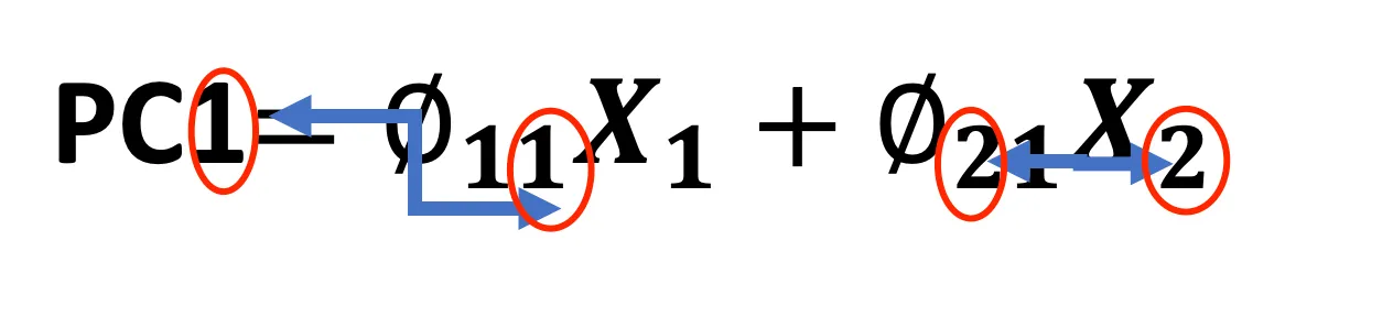
PC1 = ϕ11 X1 + ϕ21 X2 + … + ϕp1 Xp
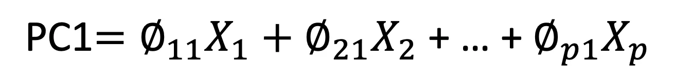
The equation above represents the first principal component (PC1). Each original feature (X1, X2, …, Xp) is multiplied by a corresponding weight (ϕ11, ϕ21, …, ϕp1) and then summed up to calculate PC1. The weights (also called loadings or Coefficients) determine how much each original feature contributes to the principal component. The principal components are orthogonal to each other, meaning they are uncorrelated, and each represents unique information.
Here’s a breakdown of the notation:
- PC1: The first principal component.
- X1, X2, …, Xp: The original features of the dataset.
- ϕ11, ϕ21, …, ϕp1: The weights assigned to each original feature for the first principal component.
The principal components are typically ordered so that PC1 accounts for as much of the variability in the data as possible, PC2 accounts for as much of the remaining variability as possible, and so on.
The “normalized” term indicates that the principal components are scaled so that their variances equal 1. This normalization is part of the PCA process to ensure that the scale of the original features doesn’t bias the analysis.
In essence, PCA transforms a set of possibly correlated features into a set of values of linearly uncorrelated variables, which can then be used to simplify the dataset while retaining its essential characteristics.
In the previous example:

Note: The first Number in the Coefficient refers to the Feature, and the second number refers to the PC1.
By projecting the two dimensions/features to one dimension (PC1), we went from 2 dimensions (Feature1 and Feature2) to one dimension (PC1). It is taking some information from Feature1 and some information from Feature2.
An Example with Numbers:
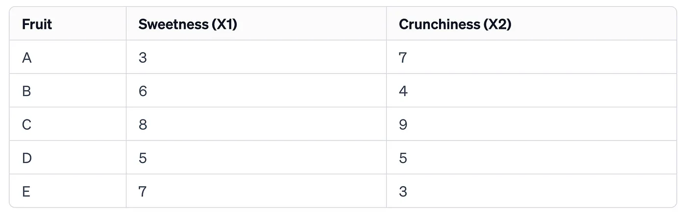
Imagine you have a dataset about different fruits. Each fruit is described by its sweetness and crunchiness on a scale of 1 to 10. Here, you have only two features (sweetness and crunchiness), so it’s a two-dimensional dataset. However, if you wanted to compare these fruits with a single value instead of two, you could use PCA to find the best single dimension that captures the most information about the fruits’ characteristics.
To visualize this, consider the following small dataset:
If you plot these points on a graph, you’ll see that they spread out in two dimensions, as shown below:
Now, PCA will look for the “direction” in which the points are most spread out. This direction is called the first principal component (PCA1). It is the line where if you project all your points onto it, the spread (or variance) of the points along the line is maximized. The variance is a measure of how far the points are from the mean, and in the context of PCA, it’s a measure of how much information is retained.
The second principal component (PCA2) would be a line perpendicular to PCA1 and represents the next level of variance. However, in our simplified example, we are only looking for one principal component because we want to reduce our two-dimensional data (sweetness and crunchiness) to a single dimension.
So, applying PCA to our fruit dataset, we would find a line (PCA1) along which to project our data points. This line would best summarize the spread of our fruits in terms of sweetness and crunchiness. Each fruit’s position on this line gives us a single value that reflects both its sweetness and crunchiness.
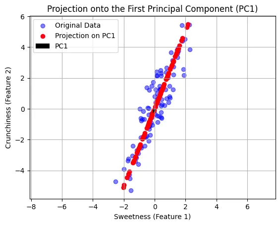
Let’s create a plot showing our original data points, the projected points, and the first principal component (PCA1).
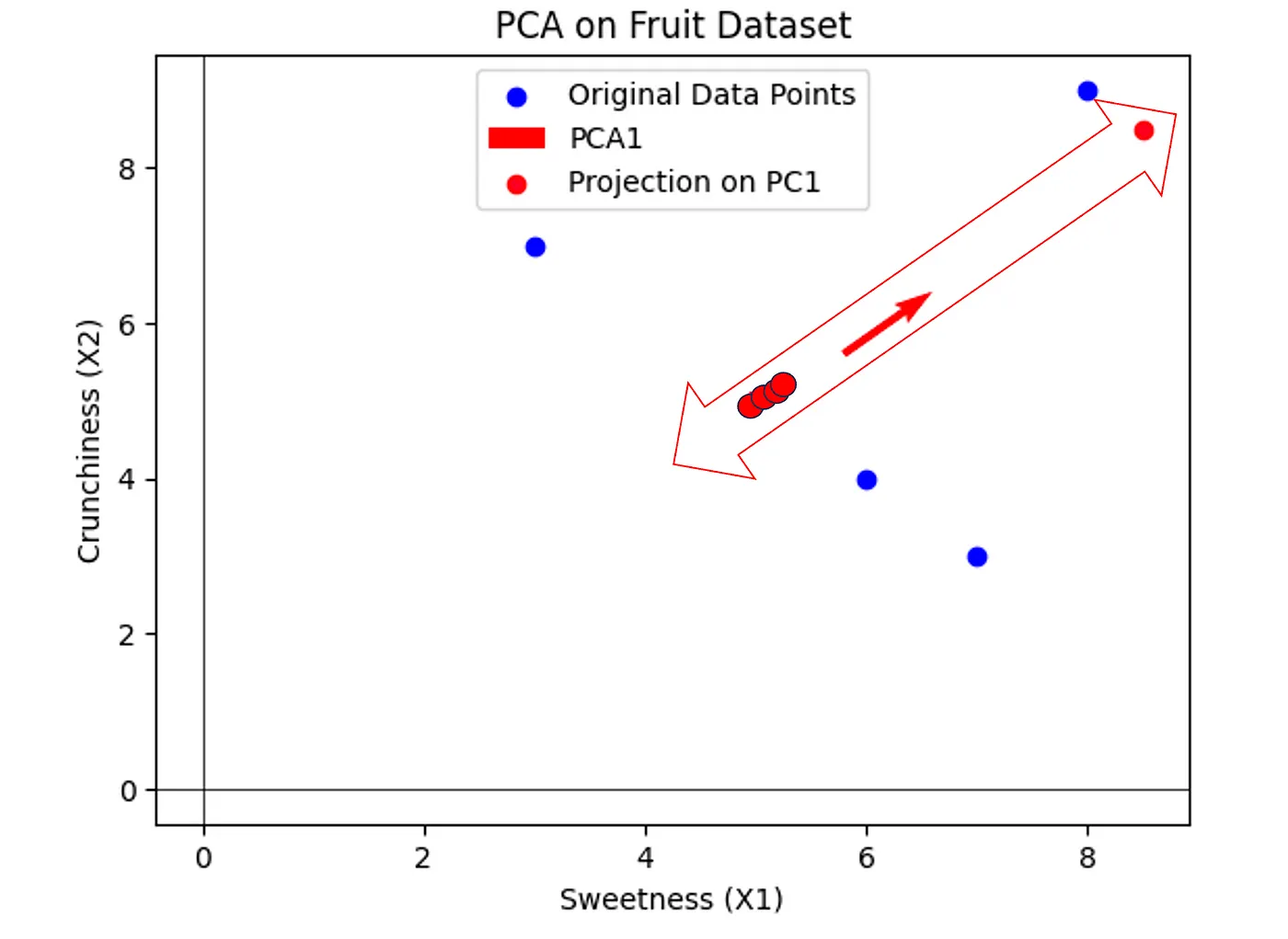
In the plot above, we have our original data points in blue, which represent different fruits with their respective sweetness (X1) and crunchiness (X2) values. These points are spread across two dimensions.
The red arrow represents the first principal component (PCA1). This line is the direction along which the variance of the data is maximized. In simpler terms, if we project our fruits onto this line (the red points), the new positions will give us values that encapsulate a combination of both sweetness and crunchiness. This allows us to compare the fruits along a single value that still considers both original features.
By reducing our dataset to this one dimension, we simplify our comparison without losing the essence of what makes each fruit unique in terms of sweetness and crunchiness. This is the core of PCA — finding the best summary of the data with minimal loss of information.